Net Yield
See the real return per asset after voids, service charges, and maintenance. Not gross. Not guesswork. The number you can actually manage against.
7.4%
Up 0.6%
128 units tracked
Knowing your true net yield per property shouldn’t be a monthly puzzle. See it live, by postcode, by property type. That means quicker decisions, cleaner reporting, and fewer surprises when rent roll, arrears, and repairs start pulling in different directions.
Emery Apex Group builds AI-powered dashboards for letting agents, landlords, and property managers who want one clear view of performance. Want to know which blocks are carrying the portfolio and which ones are quietly eroding return?
A borough-level heat map gives you the real picture. Where are the strongest returns today, and where are planned developments likely to shift the numbers next quarter?
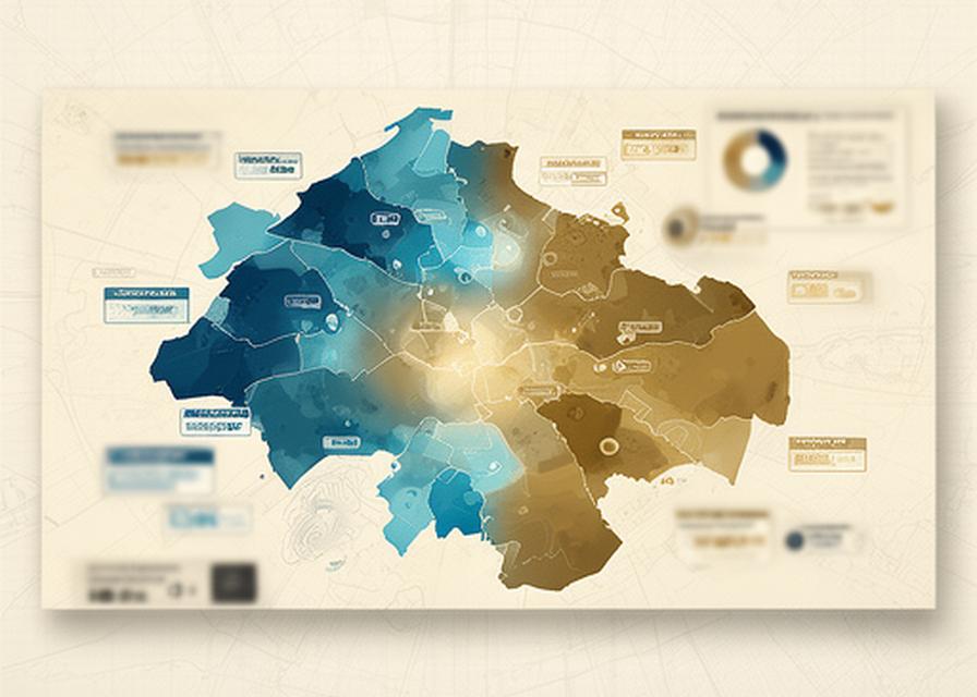
A bento grid keeps the story tight. You get the headline figure, then the supporting signals that explain why it moved. Simple enough for a board pack, sharp enough for day-to-day management.
See the real return per asset after voids, service charges, and maintenance. Not gross. Not guesswork. The number you can actually manage against.
Flag lease-end clusters before they become empty stock. That gives your team time to act, rather than react after the income has already slipped.
Spot slow payers early, compare blocks, and watch collections by manager, scheme, or region.
See when repair spend starts crowding out return. Is one building quietly eating the margin?
Keep refurb and new-build programmes visible with progress that makes sense to the people paying for them.
A good Gantt chart should answer one question fast: what moves if this slips? With AI delay predictions, you’ll see dependencies before they turn into excuses.
Predictive alerts based on weather, material lead times, and sequencing pressure.
AI delay warningsLate payment risk should never sit hidden in a monthly export. Why wait for a missed rent reminder when the pattern is already there?
Bank feed detection catches missed payments automatically, then pushes the issue into view before month-end reporting makes it expensive.
A low-to-moderate exposure profile today. Want the same for next month?
A few words from teams who wanted less spreadsheet drama and more useful answers. Different firms, same result: clearer reporting and faster action.
“We saved 10 hours a week on reporting. The dashboard made the whole portfolio feel manageable again.”
“Emery Apex Group gave us a proper view of yield, arrears, and project risk in one place. The Gantt chart AI flagged a two-week delay early, and that warning probably saved the handover.”
“Why did we choose Emery Apex Group? Because the answer stopped living in five different reports and started living on one screen.”
Book a property analytics demo and we’ll walk you through yield tracking, heat maps, arrears risk, and project progress in one clean session. Why keep piecing it together by hand?